I've just been rebuilding my website and have it uploaded now. Tested on some platforms, but it's always a good idea to find out if it works on a very broad range of browsers and platforms, as well as getting comments on if it's any bloody good in the first place.
As in all things in life, it's a work in progress, that will be refined in time, and hopefully stands the test of time in the way of design, and content.
So, if you'll indulge me, and have the time. comments are appreciated.
Barron River Guitars
Website Re-vamp. Comments Please
-
Dennis Leahy

- Blackwood
- Posts: 872
- Joined: Wed Oct 10, 2007 12:32 am
- Location: Duluth, MN, US
- Contact:
Allen,
It is clean, easy to navigate, and uses nice crisp photos. I think it is a great start, like the beginning chapter of a good book that makes you want more - and so there's room to expand some of the pages content (for example, expand the Process page to include more verbiage and photos.)
A small suggestion would be to include some graphics of some sort on every page, such as Ordering and Warranty - maybe a chance to use some artsy close-ups of instrument details.
Dennis
Another damn Yank!
Congrats Allen!
I checked out your site on a Mac with both Safari and Firefox and everything worked perfectly.
A couple of nits that I would suggest if I may please.
First the white background looks a bit stark and was not easy on my eyes. Perhaps even a very light grey/gray would help. I like black framed web sites in fact black is my favorite color but it can make readability a little difficult.
Next take it from me my friend people buy (things - anything) from people. For many folks the "relationship" is an important consideration when selecting a vendor. Where I am going with this is it might be helpful if somewhere on your site you included a picture of you Luthing a bit. Perhaps with chisel in hand concentrating on your craft. After all the first step in the sales process for prospects is to get in contact with you. It may ease the process if they can get a visual and have a bit of a set expectation. Lots of luthiers do this with their sites and unless they look like Quasimodo I think that it's a cool thing to do.
Overall I like your site and think that you have done a very good job. I also wanted to ask you what site creation software you are using?
I checked out your site on a Mac with both Safari and Firefox and everything worked perfectly.
A couple of nits that I would suggest if I may please.
First the white background looks a bit stark and was not easy on my eyes. Perhaps even a very light grey/gray would help. I like black framed web sites in fact black is my favorite color but it can make readability a little difficult.
Next take it from me my friend people buy (things - anything) from people. For many folks the "relationship" is an important consideration when selecting a vendor. Where I am going with this is it might be helpful if somewhere on your site you included a picture of you Luthing a bit.
Overall I like your site and think that you have done a very good job. I also wanted to ask you what site creation software you are using?

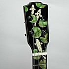
Nicely done Allen. I agree with the comments made so far. I would add that you might want to reshoot the photo of your headstock inlay. The background is so light compared to the headstock that it is sort of difficult to see well. It looks like its in shadow. Or it could be the screen on my laptop.
I would also suggest pictures on the workbench page to go with the links. Images pull people in.
Overall, I like it a lot.
I asked Fran to check it out and she found it to be easy to navigate, the sections all made sense, good lay out, but she came to the same conclusion, it needs more photos of what you've working on and what you've done. Not everyone who will be looking at your site will understand guitars, they are there looking to buy an experience for someone dear to them and need the eye candy more than we do.

Al,
Theres something wrong...I keep getting redirected to some porn site:
www.luthiersinbacklesschaps.com
Theres something wrong...I keep getting redirected to some porn site:
www.luthiersinbacklesschaps.com
-
J.F. Custom
- Blackwood
- Posts: 778
- Joined: Fri May 01, 2009 9:13 pm
- Location: Brisbane
- Contact:
G'day Allen,
Just checked out the updated site - very nice work.
I like its simplicity and 'no frills' type layout/appearance. As you suggest, it is a design that will stand the test of time.
My suggestions are along similar lines to those mentioned so I won't re-hash and I make note of your comment 'it is a work in progress', so these aspects could already be on the table.
A gallery of sorts I think is a must. In this, I would also have links to your sound files where relevant. If you are still building by either option or default with the adjustable neck, I think you need to create somewhere to detail this aspect/process. It makes for a point of interest to the potential buyer and difference to competitors instruments. It also shows your level of commitment and refinement in the construction process.
Lastly, on your 'Process' page, the blurb under 'Our Commitment' to my thinking is a bit repetitive. It's just in the wording - sounds like I am reading the same paragraph twice. Could be just me. Oh, and a minor typo - on your 'Tonewoods' page, Zircote to the best of my knowledge should be Ziricote. That's all!
Great work mate... Except that major stuff up with your header. I feel bad about picking you up on this but mate, Shoppe is spelled Shop - there is no 'pe I'm afraid... Sheesh.

Hope it's helpful, cheers,
Jeremy.
Just checked out the updated site - very nice work.
I like its simplicity and 'no frills' type layout/appearance. As you suggest, it is a design that will stand the test of time.
My suggestions are along similar lines to those mentioned so I won't re-hash and I make note of your comment 'it is a work in progress', so these aspects could already be on the table.
A gallery of sorts I think is a must. In this, I would also have links to your sound files where relevant. If you are still building by either option or default with the adjustable neck, I think you need to create somewhere to detail this aspect/process. It makes for a point of interest to the potential buyer and difference to competitors instruments. It also shows your level of commitment and refinement in the construction process.
Lastly, on your 'Process' page, the blurb under 'Our Commitment' to my thinking is a bit repetitive. It's just in the wording - sounds like I am reading the same paragraph twice. Could be just me. Oh, and a minor typo - on your 'Tonewoods' page, Zircote to the best of my knowledge should be Ziricote. That's all!
Great work mate... Except that major stuff up with your header. I feel bad about picking you up on this but mate, Shoppe is spelled Shop - there is no 'pe I'm afraid... Sheesh.
Hope it's helpful, cheers,
Jeremy.
Thanks everyone. It's great to get feedback from others, as looking at something for so long, you start to see things that aren't there, and things that are, you just overlook. I'll start to make the changes suggested.
Hesh, I'm on a Mac as well, and the software is Rapidweaver. I've used Dreamweaver for years, and the last website was built with iWeb, but I much prefer Rapidweaver now.
Maritn......what can I say....good one.
Hesh, I'm on a Mac as well, and the software is Rapidweaver. I've used Dreamweaver for years, and the last website was built with iWeb, but I much prefer Rapidweaver now.
Maritn......what can I say....good one.
Hi Allen,
I went and had a browse.......its a very clean and tidy website, reminds me of those pictures of Hesh's workshop! Its easy to navigate, not too many levels, love the pictures, loads fairly quickly and its easy to get to the contacts page. And I love the pictures.
As for constructive criticism.....
The sound files didn't work for me, I apparently don't have the right software and Windows is off somewhere looking for it - my PC isn't old but my op sys is, so thats maybe the problem - but can I suggest you try a random survey of 6 people who would not normally go to your site, if it works for all six, great, if it doesnt for one or two of them then that's up to 30% of orders you might potetnitally have lost... Is there a more universally usable sound file format? (note patent lack of tech savvy on my part!)
I didnt like having to click three times to get to the price, but when I got there, I was impressed. I'd say that is pretty good value. I spend a bit of time in guitar shops (insert correct emoticon for understatement), these days I'm usually checking out the build and detail instead of drooling and trying to convince management that I need another one, but I would much, much sooner pay your price for a hand made beauty like those on your site than some fairly boring Martin that looks like half of it is made out of cardboard. My point is, your price is seems to me to a major selling point. I'd have it on the front page!
Minor nit picking point, I spotted a typo, "stores such as Music City in Cairns Queensland,. and will be listed as such on our website". I don't think you need a comma before "and", but you definitely dont need a comma and a full stop.
Great site, great guitars.
Cheers and good luck.
Richard
PS Are you running Google analytics to see who is coming and looking?? (its free!!). Adwords is worth considering too.
PPS Did I mention I love the pictures. More pictures!!
Richard
-
J.F. Custom
- Blackwood
- Posts: 778
- Joined: Fri May 01, 2009 9:13 pm
- Location: Brisbane
- Contact:
Some of your comments have just been implemented into the website, and it's been updated. Others are going to take some time. If you've ever built a website, you'll appreciate how much time it takes to get all these details in place, then having them work on all operating systems and browsers.
Up for further improvements is a gallery and sound clips. Changes to navigation. And of course, more photos.
First off is the inclusion of a picture of me taken at the Tanks Markets about a year ago by a forum member from New Zealand while on a holiday in Cairns.
As some of you commented, I use "we" on my site, to include my wife in the process, because, lets face it. If they aren't behind you, then it's not going to be much fun. And she does help out far more that she realizes. But after talking to her about the "I and we" issue, she feels that it's a more personal thing if the phasing is changed to the singular.
I consolidated two pages that were similar in scope, and change some wording, corrected spelling, and punctuation.
The sound clips are MP4's. Default for iTunes, and ipods and such. I'll have to change them to MP3's for more compatibility.
Once again. Thankyou to everyone for taking the time to view and comment.
-
J.F. Custom
- Blackwood
- Posts: 778
- Joined: Fri May 01, 2009 9:13 pm
- Location: Brisbane
- Contact:
-
John Maddison

- Blackwood
- Posts: 354
- Joined: Tue Jun 03, 2008 11:15 pm
- Location: Albany, Western Australia
- Contact:
G'day Allen
Nice work with the new look website, although I also really liked the look of the 'old' one; namely the galleries and lightly-textured background. White as a background looks OK on the new site, but sooooooo many websites use white.
A minor aesthetic page layout thing .... on Features page I'd either shorten the text for 'Tops' and 'Finishing' or reduce the size of the adjacent pics a little so the text 'fits' a bit better on page, as is the case with the other sub-headings.
On Contacts page can I suggest you make your email address 'hidden' as you've done in the footer on each page (Contact Me) ... by putting active email addresses on a web page you are inviting spammers to harvest it using their insidious bots. While on that page, I'd also include the international dialling option on your home phone ... probably + 61 7 4036 etc ?? for the convenience of overseas visitor to your new site.
Good idea about converting sound bites to the more universal MP3 format. Apple hasn't taken over the world's computer market, yet .
.
All in all, it's a nice and clean build, just like your instruments mate!
Cheers
Nice work with the new look website, although I also really liked the look of the 'old' one; namely the galleries and lightly-textured background. White as a background looks OK on the new site, but sooooooo many websites use white.
A minor aesthetic page layout thing .... on Features page I'd either shorten the text for 'Tops' and 'Finishing' or reduce the size of the adjacent pics a little so the text 'fits' a bit better on page, as is the case with the other sub-headings.
On Contacts page can I suggest you make your email address 'hidden' as you've done in the footer on each page (Contact Me) ... by putting active email addresses on a web page you are inviting spammers to harvest it using their insidious bots. While on that page, I'd also include the international dialling option on your home phone ... probably + 61 7 4036 etc ?? for the convenience of overseas visitor to your new site.
Good idea about converting sound bites to the more universal MP3 format. Apple hasn't taken over the world's computer market, yet
All in all, it's a nice and clean build, just like your instruments mate!
Cheers
John M
-
Dennis Leahy
- Blackwood
- Posts: 872
- Joined: Wed Oct 10, 2007 12:32 am
- Location: Duluth, MN, US
- Contact:
Allen,
I like the new stuff! That headstock of yours, hidden from view until and unless you go to the Contacts page has just got to be more prominently displayed. What a work of art it is!
minor fix: your email address displays with ".com", but the one in your code is ".co"
Yes, the moment you place an email address on the web, you are admitting that your penis is too short, you don't know how to make love, and that you need your mortgage refinanced. There are ways to hide your email address, but that particular email address is already "tainted." If you are willing to start over with a brand new email address, contact me and I'll give you details.
Dennis, with an extra-long penis, great skills in the sack, and a 0% 30 year fixed rate mortgage
Another damn Yank!
I think the sound samples would be better if they opened in a small pop up over the same page rather than taking priority over the written page.I like to keep reading while I listen to the sound.I know I can open them in a new tab but it is more user friendly if the link does it for you.
Allen , do you realise just how many jobs you will have once you get the template worked out for the rest of us.By the time you install all these great ideas you should be able to sell the whole lot as a package deal.
Allen , do you realise just how many jobs you will have once you get the template worked out for the rest of us.By the time you install all these great ideas you should be able to sell the whole lot as a package deal.
Cheers from Micheal.
Remember the "5P Rule".
Preparation Prevents Piss Poor Performance.
Remember the "5P Rule".
Preparation Prevents Piss Poor Performance.
Thanks mate , I needed that.
You need to rename your home page to "Barron River Guitars" so it uses that name in the list when people bookmark your site.At the moment it will bookmark "home".
By the way your doing a great job on this Karen.
You need to rename your home page to "Barron River Guitars" so it uses that name in the list when people bookmark your site.At the moment it will bookmark "home".
By the way your doing a great job on this Karen.
Cheers from Micheal.
Remember the "5P Rule".
Preparation Prevents Piss Poor Performance.
Remember the "5P Rule".
Preparation Prevents Piss Poor Performance.
Who is online
Users browsing this forum: No registered users and 23 guests