Hey folks,
Had a fiddle with a design for my guitar label over the weekend, and I'm pretty pleased with what I came up with.
What does everyone think?
Wayde.
Label design
-
charangohabsburg
- Blackwood
- Posts: 1818
- Joined: Sat Oct 16, 2010 1:25 am
- Location: Switzerland
Re: Label design
Looks clean and classy! 
I like those lables that are not cluttered with useful and/or useless information. Once I have seen a label with even the luthier's bank account number on it!
I like those lables that are not cluttered with useful and/or useless information. Once I have seen a label with even the luthier's bank account number on it!
Markus
To be stupid is like to be dead. Oneself will not be aware of it.
It's only the others who suffer.
To be stupid is like to be dead. Oneself will not be aware of it.
It's only the others who suffer.
Re: Label design
Me like a lot.
Re: Label design
Very classy. Looking at it from the perspective of a potential buyer I think it would help bring that professional, high end feel to your instruments.
Jeremy D

Re: Label design
The "Malu" doesn't do anything for me, I think its the difference in styling between that and the rest.
The whole bottom looks very classy. I really like the scrolls. They pull it all together.
The whole bottom looks very classy. I really like the scrolls. They pull it all together.
-
Wayde Christie
Re: Label design
Thanks for the feedback folks 
So I decided to make the "Malu" logo-mark cursive and friendly (and also easy to inlay), and to surround it with a combo of traditional and cultural design.
I found myself stripping out the cultural stuff though, because I'd rather move the cultural design to the guitar itself - probably in the use of timbers, and the rosette and colours.
The big challenge for me has been "how do I make this guitar embody the culture of its namesake, without alienating traditionalists (me included)?".
Dunno if I'm there yet
I struggled with that myself Allan. "Malu" is a shortened version of the aboriginal name for Newcastle, and I'm trying very hard to get that cultural vibe in there but retain the classic traditional elements of guitar design.demonx wrote:The "Malu" doesn't do anything for me, I think its the difference in styling between that and the rest.
The whole bottom looks very classy. I really like the scrolls. They pull it all together.
So I decided to make the "Malu" logo-mark cursive and friendly (and also easy to inlay), and to surround it with a combo of traditional and cultural design.
I found myself stripping out the cultural stuff though, because I'd rather move the cultural design to the guitar itself - probably in the use of timbers, and the rosette and colours.
The big challenge for me has been "how do I make this guitar embody the culture of its namesake, without alienating traditionalists (me included)?".
Dunno if I'm there yet
Re: Label design
It's not that the Malu looks bad, as on it's own it'd look fine. I just think the lower part is a different style and they don't work together - BUT - I'm not a customer, so take it with a grain of Salt.Wayde Christie wrote:Thanks for the feedback folks
I struggled with that myself Allan.....
Dunno if I'm there yet
I worked for a short time as a phototypesetter during the 1990's. I remember they had reference posters in the type room of compatible fonts, as not all fonts work with each other. The guy that was training me had rules he used to tell me all the time. No more that three different fonts. Never use this with that and so forth. I forget it all these days, however when you look at things and it stands out I just remember that room and the charts.
Re: Label design
Agree with all
Nice, uncluttered and stylish concept - stick with that theme. The grey colour to the font, scrolls etc is great too.
Have to agree with Allan though, the Malu font is a bit too "happy" for me sitting on top of the more classic cursive script. - feels like it'd be better for tropical themed surfboards and the like.
... But that's just me ... and Allan .....
...............
Kevin
Kevin
-
needsmorecowbel
- Blackwood
- Posts: 974
- Joined: Sun Oct 04, 2009 7:48 pm
- Location: Melbourne
Re: Label design
It kind of reminds me of KALA ukuleles...mainly because the "u" from malu and the "a" from kala are quite a similar shape when written in cursive. It definitely reminds me of a uke brand I saw recently but I can't quite put my finger on it.
Regardless it's looking good, keep it up!
Stu
Regardless it's looking good, keep it up!
Stu
Re: Label design
I would concur with all the honest responses above, it is clean and tidy, but the malu script looks out of character to the rest of the label. It definitely gives that uke feeling about it
Steve
Steve
Re: Label design
The font used for the detail information and the decorative flourishes both have line weights that vary significantly and do not have a drop shadow. I would want to see what it would look like with the "Malu" in a font that had varying weights depending on line direction. I don't know if it would look better, but I would want to have a look.
-Doug Shaker
Re: Label design
Great work Wayde. Looked and looked at it again and read what the others have said. I really like the Malu script and find it fits well with the scroll underneath but find letters M & u a bit distracting. Only a suggestion but is there/could you hotrod only those letters so they become stronger and easier to read.
If it were mine i would chop the scroll/flourish at the bottom of the M (sometimes i see/read almost the letter N sometimes just the flourish) and the end of the letter u, hope that makes sense.
Steve
If it were mine i would chop the scroll/flourish at the bottom of the M (sometimes i see/read almost the letter N sometimes just the flourish) and the end of the letter u, hope that makes sense.
Steve
-
DarwinStrings

- Blackwood
- Posts: 1873
- Joined: Thu Nov 13, 2008 10:27 pm
- Location: Darwin
Re: Label design
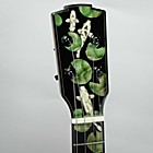
Aboriginal themes caught my attention Wayde so here are some bits I have been working on for a guitar called "Blackfella Whitefella". Bit of a nod to Warumpi Band and their achievement.
End graft
North East Arnhem Land Rarrk style Headstock.
Jim
End graft
- end graft.jpg (64.14 KiB) Viewed 16607 times
- Rarrk.jpg (78.68 KiB) Viewed 16607 times
Life is good when you are amongst the wood.
Jim Schofield
Jim Schofield
Re: Label design
Jim
I really like your end graft and your head plate, really nice design
Dave
I really like your end graft and your head plate, really nice design
Dave

-
DarwinStrings
- Blackwood
- Posts: 1873
- Joined: Thu Nov 13, 2008 10:27 pm
- Location: Darwin
Re: Label design
Thanks guys, will post the finished guitar when I finally finish it, have been caught up in building a extension at the moment and have put guitars on hold.
Jim
Jim
Life is good when you are amongst the wood.
Jim Schofield
Jim Schofield
-
Wayde Christie
Re: Label design
Wow! Thanks for the excellent feedback guys. Gave me lots to think about.
It's funny how you often think you're close to being done but you're really just beginning
I'm keen to source some traditional art from the Newcastle area if it exists, and somehow incorporate it into my guitars. I'm thinking the rosette is where I'll have the most scope for creativity.
Thanks again everyone!
It's funny how you often think you're close to being done but you're really just beginning
Good stuff Jim. I grew up in Taree so there have been a lot of aboriginal people in my life, including my new nephewDarwinStrings wrote:Aboriginal themes caught my attention Wayde so here are some bits I have been working on for a guitar called "Blackfella Whitefella". Bit of a nod to Warumpi Band and their achievement.
Jim
I'm keen to source some traditional art from the Newcastle area if it exists, and somehow incorporate it into my guitars. I'm thinking the rosette is where I'll have the most scope for creativity.
Thanks again everyone!
Who is online
Users browsing this forum: No registered users and 115 guests